CHRISTINA, EMMA & ROB - 'SHADOWS' FINAL VIDEO from cmdiploma on Vimeo.
Thursday, 18 March 2010

Wednesday, 17 March 2010
Task one:In what ways does your media product use, develop or challenge forms and conventions of real media products ?

Other video: Micheal Buble and Daisy Dares You.
Shot 1:In this shot it shows a link between the music and visuals, the music has a trumpet instrumental, and at that time a band of trumpet players come into shot.
Shot 2:This shot shows daisy dares you (daisy coburn) laying back singing, she's a pop singer and is therefore supposed to be "seducing" the viewer. She is a young singer attracting young fans and therefore needs to be seen as fun.
Shot 3: This shot shows the main singer with a girl a common theme in the pop genre, it makes the audience drawn in as it makes him seem like a "ladies man"
Shot 4:This shot shows a tea party scene which is seen in music videos like ours for example and also in Alice In Wonderland.
Shot 5:This Shot is a high angle, i really like this shot as you can see everything in the scene and it is making the shot look dreamlike as it looks like the camera is from high above looking down on the preformers.
Shot 6: This shot is an example of lighting, the candles used give an fairytale atmosphere and the lighting is not hugely deliberate which is effective, its quite similar to the lighting used in our video.
Shot 7:This is an example of a mis-en-scene, it is a party scene and the whole atmosphere reminds me of a child like atmosphere with all the confetti, almost like High School Musical.
Shot 8: This has been used before in our video and in Alice In Wonderland the Disney Movie, as they used the Drink Me Bottle Concept.
Shot 9: This shot has been used in various Pop videos featuring young girls such as Girls Aloud etc.. to make them draw the audience in, the shot is personal and therefore is attrctive to the audience.
Other video:Shadows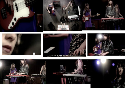 Shot 1: This shot shows the guitar paying a cord along side the music, it links the music and the visuals together.
Other video:Shadows
Shot 1: This shot shows the guitar paying a cord along side the music, it links the music and the visuals together.Shot 2:This shot shows the audience how the band want to be received. as they are a not very well known band they show a shot of all of the band together with their live instruments to show they are all together as a unit.
Shot 3:This shot shows the bands music genre as they are all playing their own instruments like similar un known bands would, its also a common aspect that an indie band have,
Shot 4:This close up of the singers lips is a common theme in music videos, such as ones by pop bands and singers.
Shot 5: The use of camera in this shot shows the artist playing their own instrument whilst singing, which makes people want to buy their music more as they have both talent in singing and in playing music.
Shot 6:The lighting in this shot is used in lots of music videos, i actually noticed it in a fellow pupils work , who covered Wicked Little Girls, it is a simple effective use of lighting which brings the singer into focus.
Shot 7:This is an example of Mis-en-Scene as the shot is a simple shot of the band preforming, the atmosphere is really professional and bring across the band as a successful band also.
Shot 8:The shot i screengrabed here is actually a shot of the camera circling the band, this shot has been used again in many pop bands videos, and is really effective.
Shot 9: This shot uses really strong lighting which has been used in videos such as Britney spears and also in various band music videos, i also saw it in Wicked Little Girls, a video produced by a fellow long road student.

Shot 1: This shot shows ali playing the keyboard along in time with the music, it makes the vidoe look more realistic and professional.
Shot 2: This shot is how i think the record company would want their artist to be percieved, its a close up shot of the main singer making the viewer feel like they are more 'intimate' with the artist.
Shot 3: This is a shot of all the main singer and all of the characters in the video, this is a good representation of genre, as everything is very vinatge and 'cute' which fits in with the pop genre, as it looks natural and happy. It also fits in with the theme, therefore being an accurate representaion of how the record company wants their artist to be percieved like.
Shot 4: This shot is of max dressed up in a mad hatter outfit. This clearly fits in to the alice in wonderland movie, due to the costume, and the overall atmosphere of the video.
Shot 5: This shot is a of a zoom into the middle of the moving clock followed by a fade. I really like this shot, as the movement of the ticking clock handle makes the image by itself amazing, but the zoom reminds me so much of alice in wonderland, and alomost a going back in time effect.
Shot 6: This shot shows the lighting in our video. We used fairy lights hanging in the tree as our main source of light as well as the little natural light there was. We thought it gave a really amazing fairytale effect, which brought our set to life. I loved the final effect it had on our video and i think it actually made our video.
Shot 7:This shot shows our mis-en-scene. The shot is from the tea party scene, where everything is sped up. I think in that scene in particualr you got a really good concept of what our video was about. You had all the key elements, characters & costume, Main Preformer, Props and the acctual tea party it self. I think as a viewer this moment in time is when the more surreal element comes in to play in our video with the help of the characters.
Shot 8:Unusually this hasnt acctaully been used in a video i have heard of..or seen, but this shot, when i first saw it did remind me of the intro to the music video Girls aloud : Loving Kind. Lots of different lights flicker on and its like a set of flickering light bulbs. Light is a big concept throughout the video, and when filming close ups slight blurred lights are shown in the background.
Shot 8:Unusually this hasnt acctaully been used in a video i have heard of..or seen, but this shot, when i first saw it did remind me of the intro to the music video Girls aloud : Loving Kind. Lots of different lights flicker on and its like a set of flickering light bulbs. Light is a big concept throughout the video, and when filming close ups slight blurred lights are shown in the background.
Shot 9:Although i havnt seen an exact replica of the efect we done on this shot, where charcters change places, (almost like stop motion) I did find a similar effect in yet again, another girls aloud video, Biology. The differnece is that the artists in girls aloud changed outfits with a movement , eg a turn. I think that was really effective and like in our video went with the beat of the music.
Task 2:How effective is the combination of your main product and ancillary texts?

This is a picture i made on Photoshop to show the links between my music video and my poster and digipack.
The links are:
Colour: The lighting in the music video was quite dark so the colours were quite grey and the costumes were fairly light colours, eg pastels, so therefore in my digipack and poster i made the saturation on my images more to make the images lighter and more of a greyish colour to link them with the video, i also still used light colours for costumes.
Tea Party: In our video the tea party scene was a main aspect of our video and i brought this into my digi pack and poster also. the set for my photos was a tea party on a bed which i thought brought and abstract look to the photos. I still incorporated tea cups and tea party props in the photos to keep a link between the two.
Lighting: In the band preformance scene we used fairy lights in the trees to five a almost dreamlike/fairytale effect. I also used fairy lights in my photos, they were hung over the bed. Although it was quite subtle i think it worked really well and made sure there was a continuous link between my video and my digipack and poster.
Alice In Wonderland: During the video we had people dress up as characters from alice in wonderland to keep up the fairy tale atmosphere. We had Alice;the Mad Hatter;Queen of Hearts and A playing card. Although it was difficult i tried to keep this theme throughout my digipack, however it did not appear in any of my final chosen photos, here however is an exmaple:

These are Alice and wonderland playing cards which were scattered over the bed to give a more Alice in wonderland look to the photoshoot.
Task 3:What have you learned from your audience feedback?

I took all the feedback from my Rough Cut, my Pitch, My final video, and feedback from ben gee.
I decided to make a word cloud as it is more visually interesting to me.
These are all the positive things we were told.

This is my negative Word cloud.
Alot of this feedaback changed a few things in our video for example:
-We tried to put an effect on the video to make the band preformance not as dark
- We covered my giggling with appropriate cut aways
- The blurry parts of the video we layered the same shot over the shot and made the blur look deliberate.
- we made me look better as a preformer by making sure at any point where i wasnt convincing we would cut away to something else.
- The lip syncing we fixed by moving the film along on the timeline, or if we couldnt fix it we would cover the error with a cut away.
All of our feedbak, negative and positive, was a huge help. whether it was a confidence boost or a push in the right direction, it was really appreciated. I also got individual feedback from peers in just day to day chats about our work which was all mainly positive and any negative points they had to make they discussed with me possible ideas to fix them.
Unfortunaltly i was having problems with my computer when we done drafts of our digi packs so i never had that feedback. However when speaking to nick about my final version he seemed really impressed which was a huge confidence boost. He liked the fact i incorporated the same theme from my video in to my digi pack and poster, and also the fact that i took time to take my own pictures for my work, and not just taking them from my video as screengrabs as it gave it more individuality.
LINKS.
IF YOU WANT TO SEE PICTURES BIGGER JUST CLICK ON THEM.
Task 4:How did you use new media technologies in the construction and research, planning and evaluation stages?

1: Final Cut- we used this to do all of our editing for our rough cut and our final music video.
2:Myspace: we used this to email Au Revoir Simone so as to get in contact with them.
3:Google: I used google as a search engine to do research in and out of class.
4:Tag Cloud: i used this to help me with task 3 in my evaluation project.
5:Flickr: I used this to find pictures to go on my blog and to go onto my moodboards etc.
6:Itunes: I used this to download Shadows on to my ipod.
7:Photobucket: I used this to find pictures that related to my idea and to use on my moodboard.
8:Facebook: I used this to get pictures for my blog of costumes etc..
9: Youtube: I used this to find influential videos to help me with my project etc..
10:Blogger: This was my Blog where i kept all my planning and research.
11:Photoshop: This is the software i used to edit photos for my Digipack and Poster.
12:Vimeo: I uploaded all versions of our music video on to this and this is where we got feedback.

In the picture there are the following items we used in our video:
Computer: We used this for editing our video and digi pack and also doing any research or blog work.
Camera: We used this to film all of our music video, and we also used this to capture our video on the the Computer.
Tripod: We used this in our video as we done a lot of shooting outside so it was helpfull to keep the camera steady.
Tuesday, 16 March 2010
If I Could Go Back...
If i could go back and re do this whole project again, i supose there would be a few things i would change.
Firstly i would make sure we shot LOADS more takes to make sure we had plenty of footage to work with and so we could play around with the video more.
I would of also made sure we shot from more angles, so as to make the video more interesting.
Also as i think i mainly took responsibility for the costume side of things, and although this worked out alright in the end, i would of made sure everything was more organised, along with the costumes for the band also.
Firstly i would make sure we shot LOADS more takes to make sure we had plenty of footage to work with and so we could play around with the video more.
I would of also made sure we shot from more angles, so as to make the video more interesting.
Also as i think i mainly took responsibility for the costume side of things, and although this worked out alright in the end, i would of made sure everything was more organised, along with the costumes for the band also.
Deadline day!!!

This is a screengrab of our time line for our music video.
I feel really happy with the out come of the video annd i think our concept really cam together well.
We Spoke to Nick in the morning and he said we should include more movement in the video, so we looked at that and added some subtle movement, which didnt look too fussy or deliberate and it did really work!
The Steve came along in the afternoon and said that our video had really improved from the rough cut, he mentioned perhaps having the tea party scene in black and white as it reminded him of silent movies.
We discussed this idea as a group but in the end decided to keep it in colour as we thought the video wouldnt flow as well.
After making a few little tweaks our video was doen and i think we were all very happy with it.
Thursday, 11 March 2010
Final Poster

This is my poster i made that would be placed in a small music magazine, as the band are not very well known.
I layered images on top of another to make a dreamlike effect and i think it came across really well and i like the imagery.
I put a play.com logo in the corner to say to the reader that you can buy it there.
I put the record company name and website on the poster so if readers wanted to find out more they could.
I also clearly stated the fact that there was bonus features on the CD including behind the scene footage ( we do actually have this as we shot it before filming when setting up)
I have the release date on the poster also and also a quote from a music magazine.
Like the digipack i changed the saturation to make the colours look more vintage and to give a more dreamlike look to the poster.
Final DigiPack

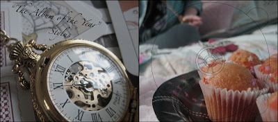
This is my final digi pack.
The image at the top is of the outside of the digipack, the front cover is of the main artist (left) and a character (right)
The colours are taken from the video and flow all the way through the digipack and poster.
The back of the cover is of yasmin, she is drinking from a teacup which links to our music video, and the tea party idea.
The bottom picture is the interior of the Digipack.
I included a quote to make the inside have a purpose and the pictures i think both really complement each other as they are close up on props and they link well together.
On all pictures i made the saturation more to give a more vintage effect and to make the colours more light.
I loved the set and i think the fact it was in a bedroom gave it a more abstract effect.
I linked the tea party theme throughout the photoshoot and i think it gave a really cute effect that linked to our video.
DigiPack font

I used the font Zapfino for my digi pack i think it really fits in with my video and the style i was going for, as it has a dreamlike fairy tale effect.
The only problem i had with it was that it wasnt coming up bold enough, but ive managed to place it in places where it is easy to read.


Au Revoir Simone Tracklist.
| 1. | Another Likely Story | |
| 2. | Shadows | |
| 3. | All Or Nothing | |
| 4. | Knight Of Wands | |
| 5. | The Last One | |
| 6. | Trace A Line | |
| 7. | Only You Can Make You Happy | |
| 8. | Take Me As I Am | |
| 9. | Anywhere You Looked | |
| 10. | Organized Scenery | |
| 11. | We Are Here | |
| 12. | Tell Me | |
| 13. | Grateful |
http://www.cduniverse.com/productinfo.asp?pid=7913836
Our Secret Record Company
http://www.oursecretrecordcompany.com/
This is Au Revoir Simone's Record Company, and i have listed their name and website on my CD and Poster.
Poster layering


I layered my images to give a dreamlike effect, the cloud picture i used i layered underneath the image and lowered the opacity, to make it lighter and dreamlike.
digipack..


This is a snapshot of my picture i edited.
I used the clone stamp tool to get rid of the barcode and label on the bottom of the mug.
Tuesday, 9 March 2010


Student Work.

I found this Poster, that a previous Long Road student made for an Au Revoir Simone song.
I really like colours they used and the texture is really effective. The text is really effective, and i love the framing of the image and the text, and the face at the side of the poster looks really effective.
I also really like the music notes layered behind the image, and i think they fit in really well with the dreamlike concept that i think the students are trying to portray.
CD Adverts.

This is a Magazine Advert i found of Gwen Stefani's CD.
As you can see it has all the main conventions of a CD advert; the image of the CD itself, the name of the album and singer, the record label, and a image taken from the CD cover itself
The text fits in with the singers style and so does the image itself.
Poster ideas.


These are some images i found that i really like and are the sort of thing i would like for my poster idea.
I think the Tea Cup/Party will be the main theme throughout my DigiPack and Poster like they were a big element in my video.
I like the vintage image at the top as that was the theme we were originally going for in our video, and it would be nice to bring that concept back.
I also like the bottom image as i like how the background is black and white and the Tea Cup is in colour.
Subscribe to:
Posts (Atom)